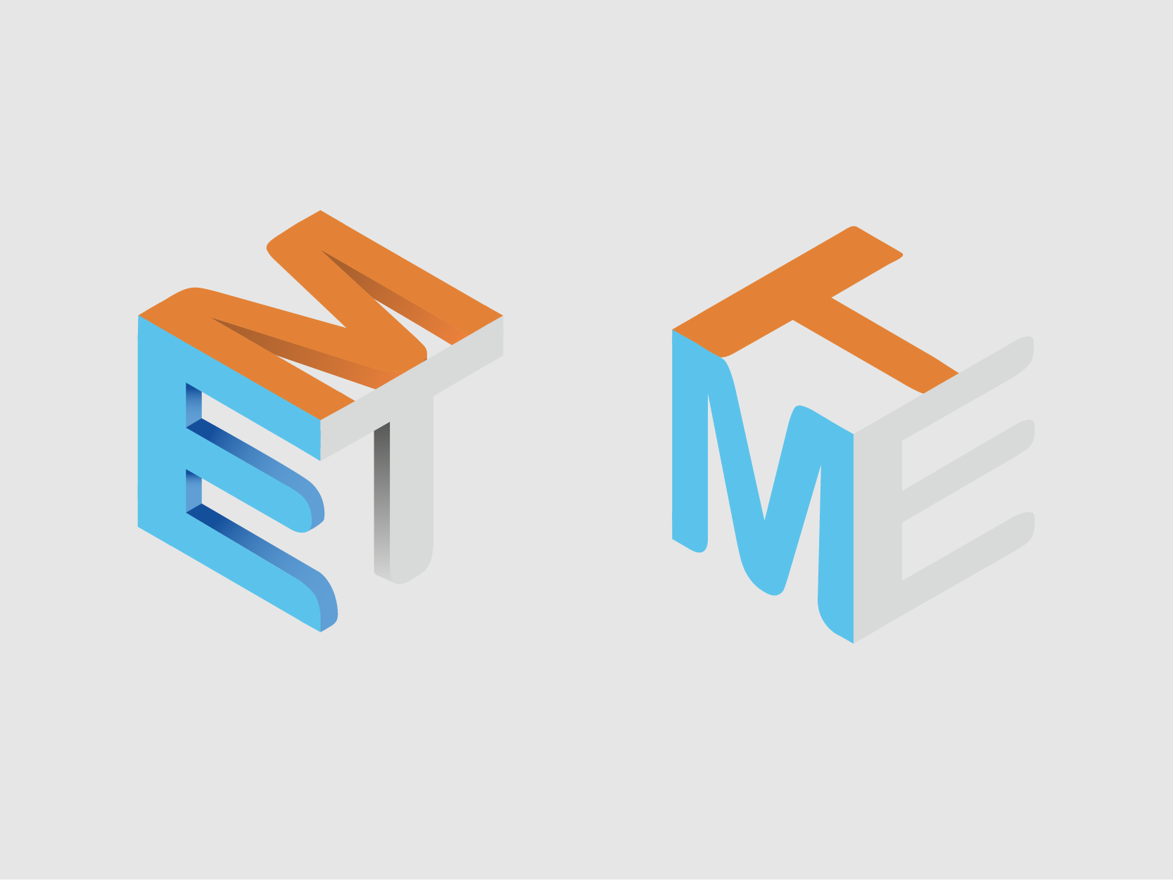
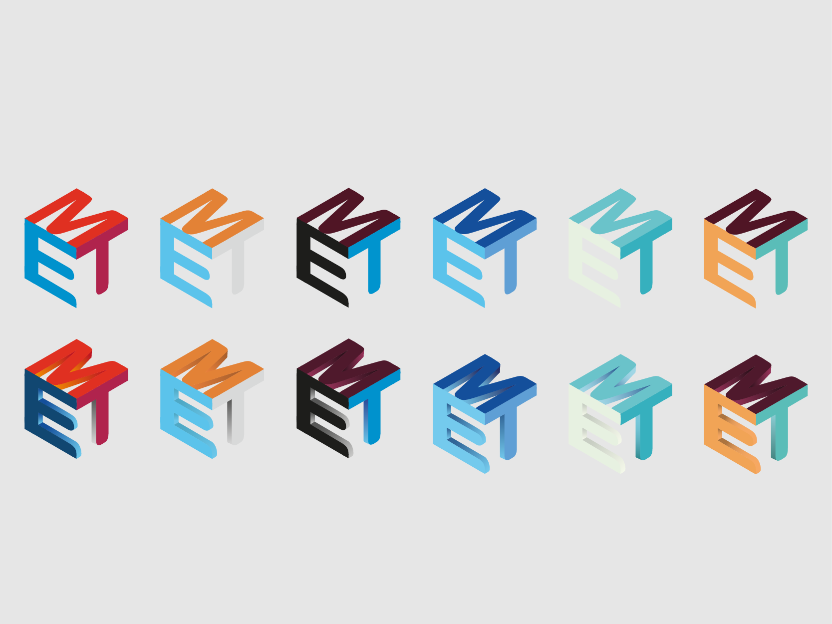
I went with the suggested letter box design. Initially I wasn’t sure how to line everything up so I had to use YouTube University which gave me the method for creating this. To ensure everything lined up I used 8 bit lettering. Although this style looked nice it didn’t evoke the technology aspect of the logo. After some research of popular technology logos I decided a smoother more rounded typography was needed.


